How to make long web pages easy for your readers

Earlier this year, during a webinar on Web Writing, I shared the concept of interaction cost. Familiar to UX/UI designers, this concept helps us understand that the more work (reading, scrolling, clicking, decision-making, even thinking) you make people do, the less likely they are to stick around and engage with your content.
After the webinar, one attendee sent me this question:
I loved your slide about the things people don't want to do, but how do you find the right balance? Sometimes it feels like there are two options: (1) a really long page people would have to scroll through/around; or (2) a landing page that people would have to click on to get to the sub-topic they want. I feel like we are confronted with either lots of scrolling or lots of clicking, and I don't like either option. Even if we write it plainly it can still end up as a lot of text!
I get this type of question often, no matter the writing topic: Okay Casey, short and sweet sounds great, but what if my [insert any type of content here] just has to be long and complex?
Here are three options for an info-dense web page, with examples:
1. A linked table of contents at the top of a long page

This option lets people choose to (a) scroll and decide where to stop, or (b) click and be taken to a specific chunk of content within the page (but not be taken to an entirely new page, which can be frustrating).
You can see this option in action on the Federal Trade Commission’s page on Weather Emergencies.
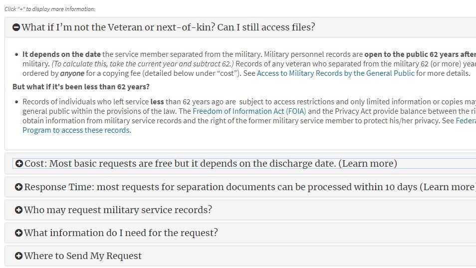
2. Drop-down sections
These function in much the same manner as a clickable table of contents, but keep the page looking even shorter and tidier until a reader chooses to click a topic and “reveal” the info in each section. I personally like these best when only one drop-down can be open at a time, so that the page stays short no matter what.
The National Archives uses this method on their Veteran’s Service Records page.
3. Bonus low-tech option: extra-large subheadings
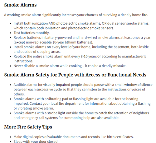
If you need to keep your solution low-tech, try adding extra-large, eye-grabbing subheadings that your readers can skim while scrolling down a long page.
The Department of Homeland Security’s page on Home Fires is a good example of a long page visually punctuated by eye-catching headlines.
Give your readers easy choices
What do each of these examples have in common? They give your reader choices. Rather than being obligated to read every word and rummage through every paragraph to find specific information, your reader can skip what’s not relevant and quickly find what is. This means they’ll only read the parts they need, and you’ve saved them time and effort.
Less work for your reader will always mean better results—for them and for you.